P::D designers and architects help you make smart decisions.

 International Market Square, Suite 109

275 Market Street

Minneapolis, MN   55406

612.927.4444

traditional

We have extensive experience designing traditional kitchens and bathrooms.

details

From Minneapolis to Anchorage, we've designed spaces for families of all sizes and lifestyles.

contemporary

If clean lines are your style, we have the products and people to create sleek interiors.

Urban Kitchen With a View

The views in a downtown Minneapolis condo create an energetic panoramic cityscape.  But the kitchen was a tired, outdated room. The owners fixed that with the help of a p4d designer and crew.

A top priority was to design the kitchen for an owner who loves to entertain and cook.  He had some specific idea about how to go about that. Also, the goal was to connect the kitchen with the open and spacious feel of the living area.

On the practical side, the white cabinetry was replaced with earth and gray tone textured cabinetry. Organic tones in the granite countertops with a touch of blue hold a raised butcher block to make food prep and cleanup more efficient.

A vertical pullout pantry, place near the range, was also worked into configuration for the custom cabinetry to give the owners added and convenient storage space.

A focal point of the newly designed kitchen is the addition of a sophisticated and timeless French made Greige range and hood.

The same footprint was maintained for the renovation but reconfigured with the help of efficient cabinetry to create more storage space. Touch latch drawer technology, a feature of the contemporary cabinetry, provided another element the owners wanted.

Now the kitchen has the energy of a contemporary landscape. (Photos/Gilbertson Photography)

A Smart Design Updates a Suburban Rambler

The thoughtful renovation of a 1950s suburban rambler creates a durable and contemporary kitchen designed to connect it to the dining and family room. Last updated in the 1970s, the p4d design transformed dated and chocked rooms into a open and welcoming space.

From the beginning the owners were clear what they didn’t want. And that was a white kitchen.

Our designer helped her clients choose among countless options to select a gray tone and glossy taupe palate that includes easy to use porcelain tile floors.

While the footprint did not change, the kitchen was stripped to the studs and re-wired to update and accommodate new appliances and kitchen electronics.

The owners can enjoy a view from the kitchen to the fireplace from a 42-inch breakfast bar added as part of the reconfiguration.

A single pane glass window and centered sink under the new widow creates flow in the room while painted glass backsplashes pull in light. Can lights were also added.

The face of the white brick wood-burning fireplace was changed to brown-black porcelain tile and wood was replaced with gas. Additional storage was added here too with custom cabinetry on either side.

A staircase leading down from the kitchen created a dead space. The stairway was

Incorporated into with the new design with unobtrusive railings and the wall color used on and in the stair well. (Photos/Gilbertson Photography)

From Powder Room to Wow Room

A red powder room with glaring light that felt like a dark utility closet was the focus of a P4D renovation designed to make a statement in a downtown Minneapolis condo.

The goal was to add a visual wow in the small room located off the entrance to the industrial style condo that is home to a couple and their two preschool children.

There were challenges.

A new design ditched dark and dated colors and addressed lighting challenges in a space whose door had to remain closed to not block the main entrance to the condo. 

The narrow space, 4 feet by 8 feet, demanded a smart, streamlined design to add light, storage and child-safe materials.

In addition, condo rules prohibited changes to the location of plumbing fixtures. 

A frosted glass panel in the powder room door creates a vertical section of soft light. Indirect light was added by dropping a soffit with LED cove lights. She also introduced a linear offset rectangular mirror with a backlit frosted glass strip. Two recessed cans with LED lights were also added to give provide light the space demanded to be welcoming and useful.

It is, as always, the particulars of design decisions that work to create this dramatic space.

A vanity with black glossy laminate drawers for added storage was cantilevered for easy of cleaning. A solid slab of honed black granite works as a strong sculptural element in the space and ties the elegant simplicity of natural materials chosen.

Dramatic textured porcelain tile used on the entrance wall in a deep blue and silver tones works with a low maintenance pebbled vinyl charcoal wall covering.

Introduction of a linear wall mounted cabinet in stainless steel laminate created additional storage. Cut outs were added to the cabinet from the toilet side for easy access of tissue and hand wipes for the children. (Photos/Gilbertson Photogrpahy)


Cabinetry Unites 3 Baths and a Powder Room

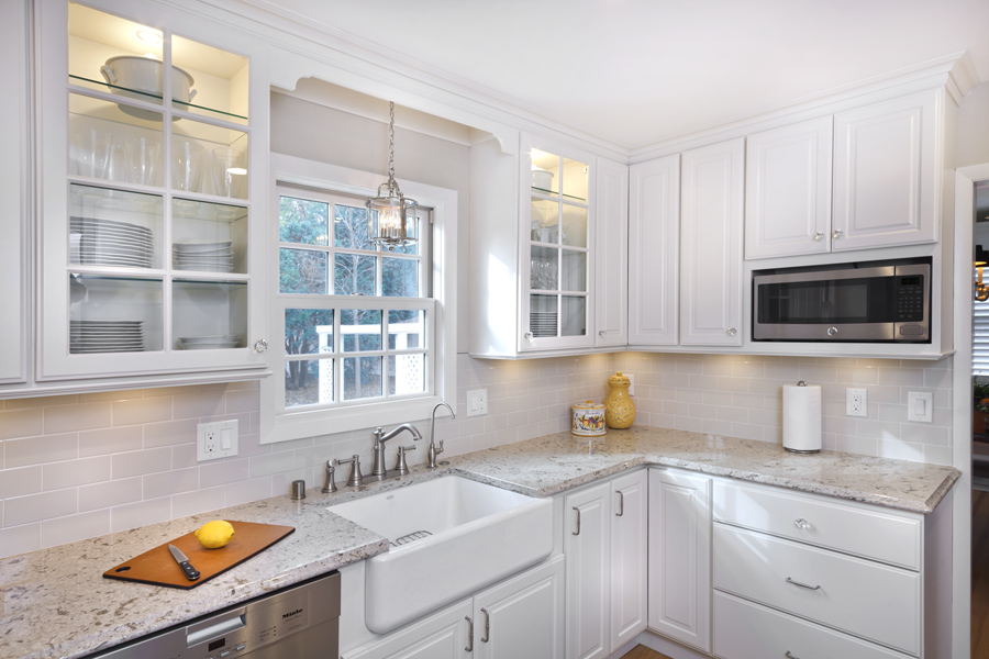
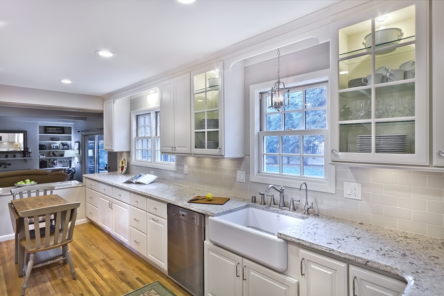
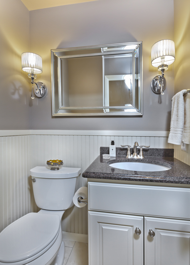
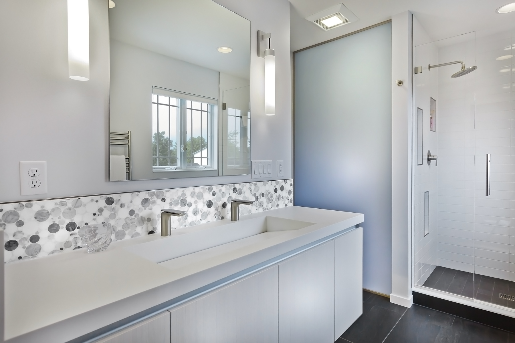
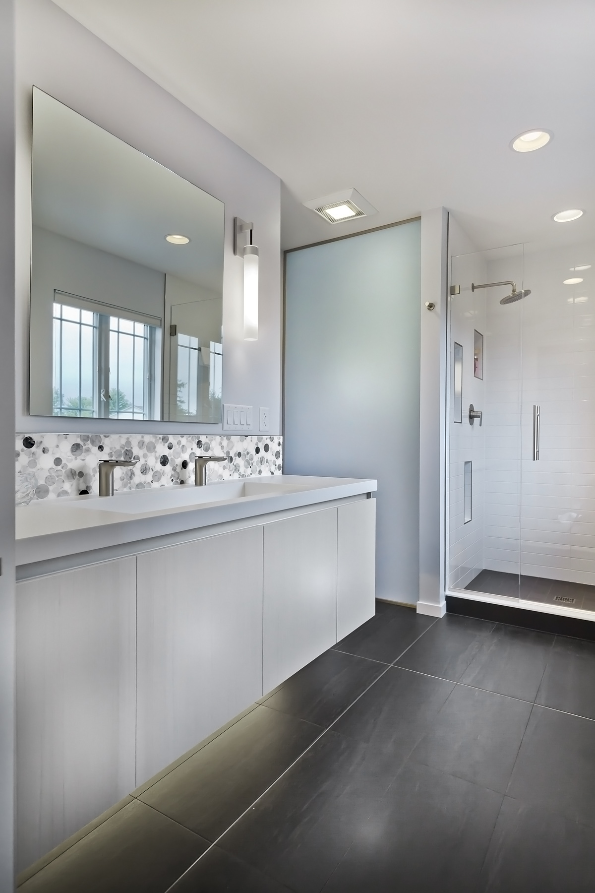
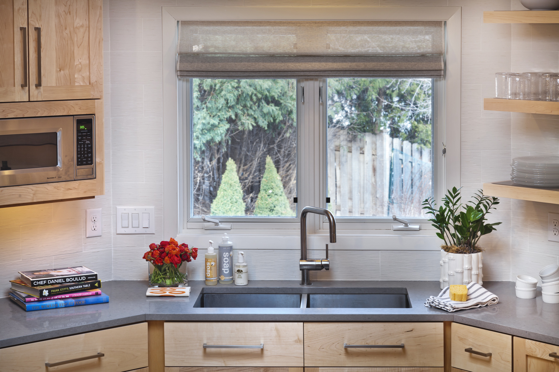
To update three baths and a powder room P4D designer Anne Newman and the owners chose a natural color scheme with flourishes of texture from natural stone and the light catching properties of porcelain tile the rooms.

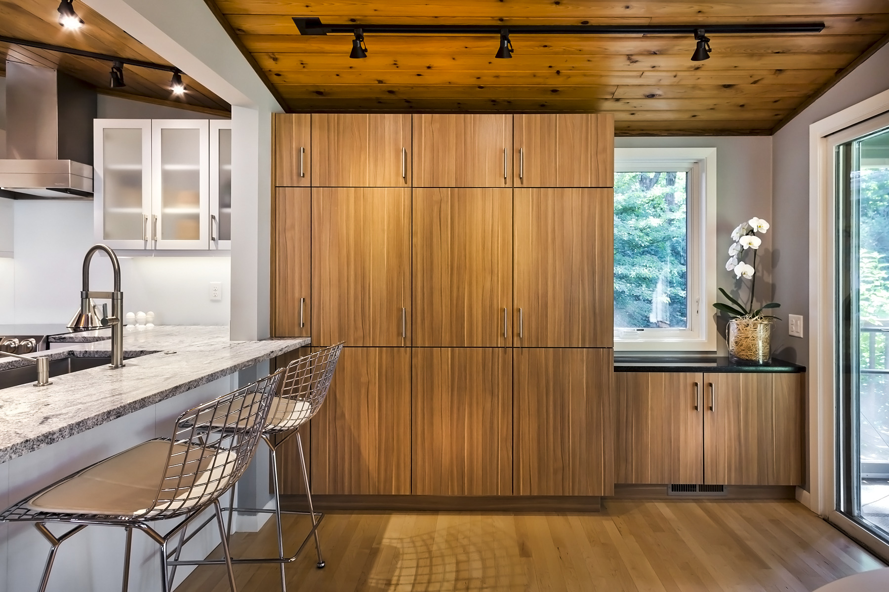
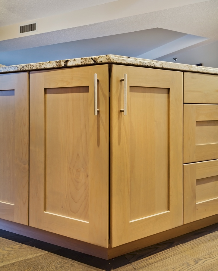
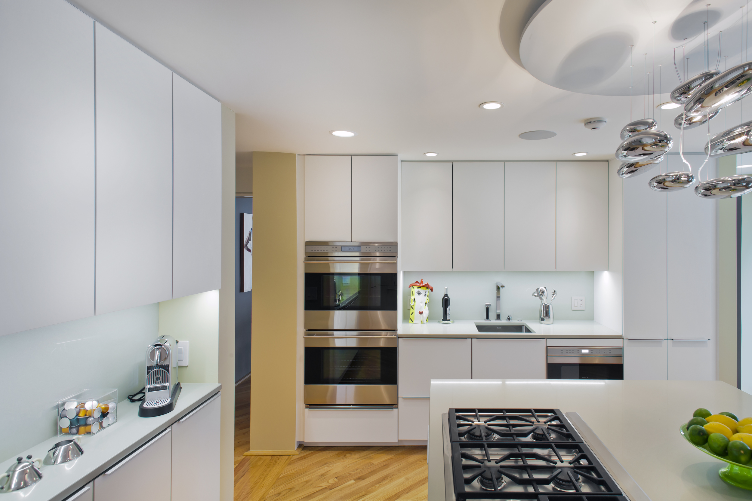
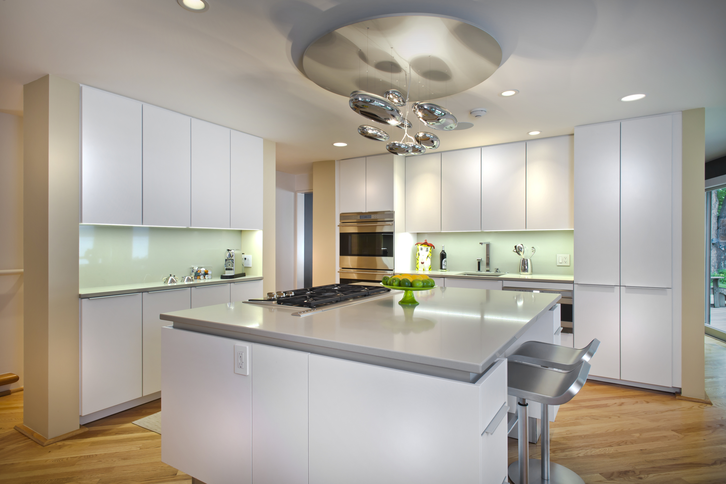
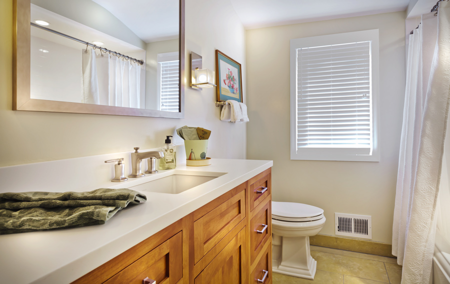
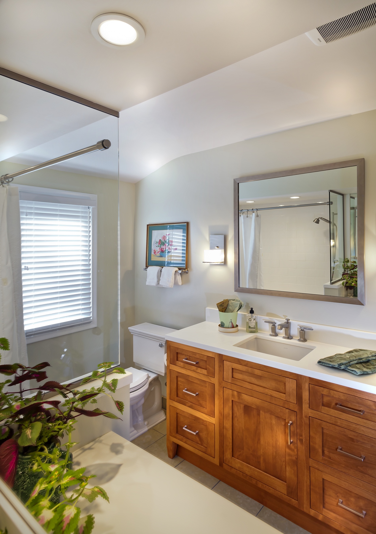
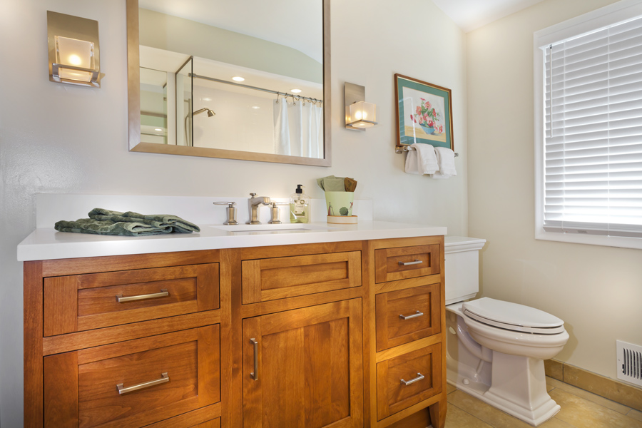
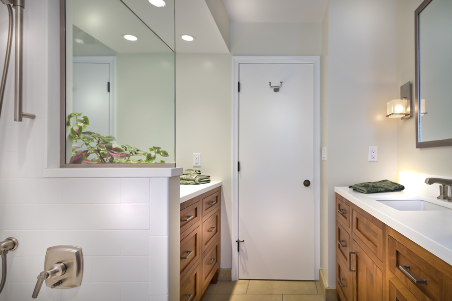
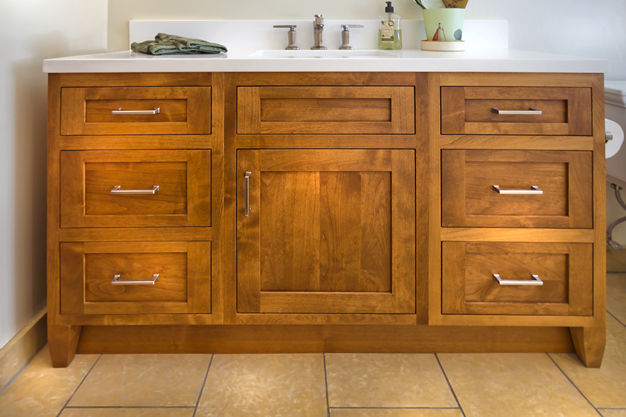
The same custom cabinetry design was used in all the rooms.

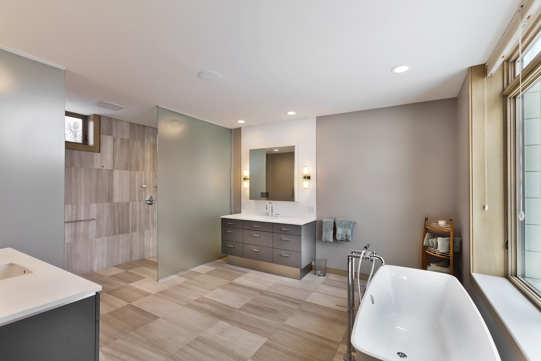
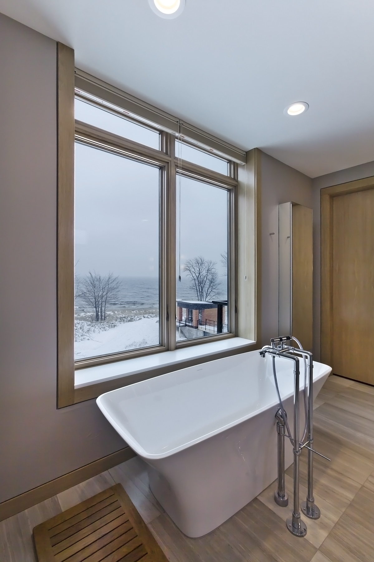
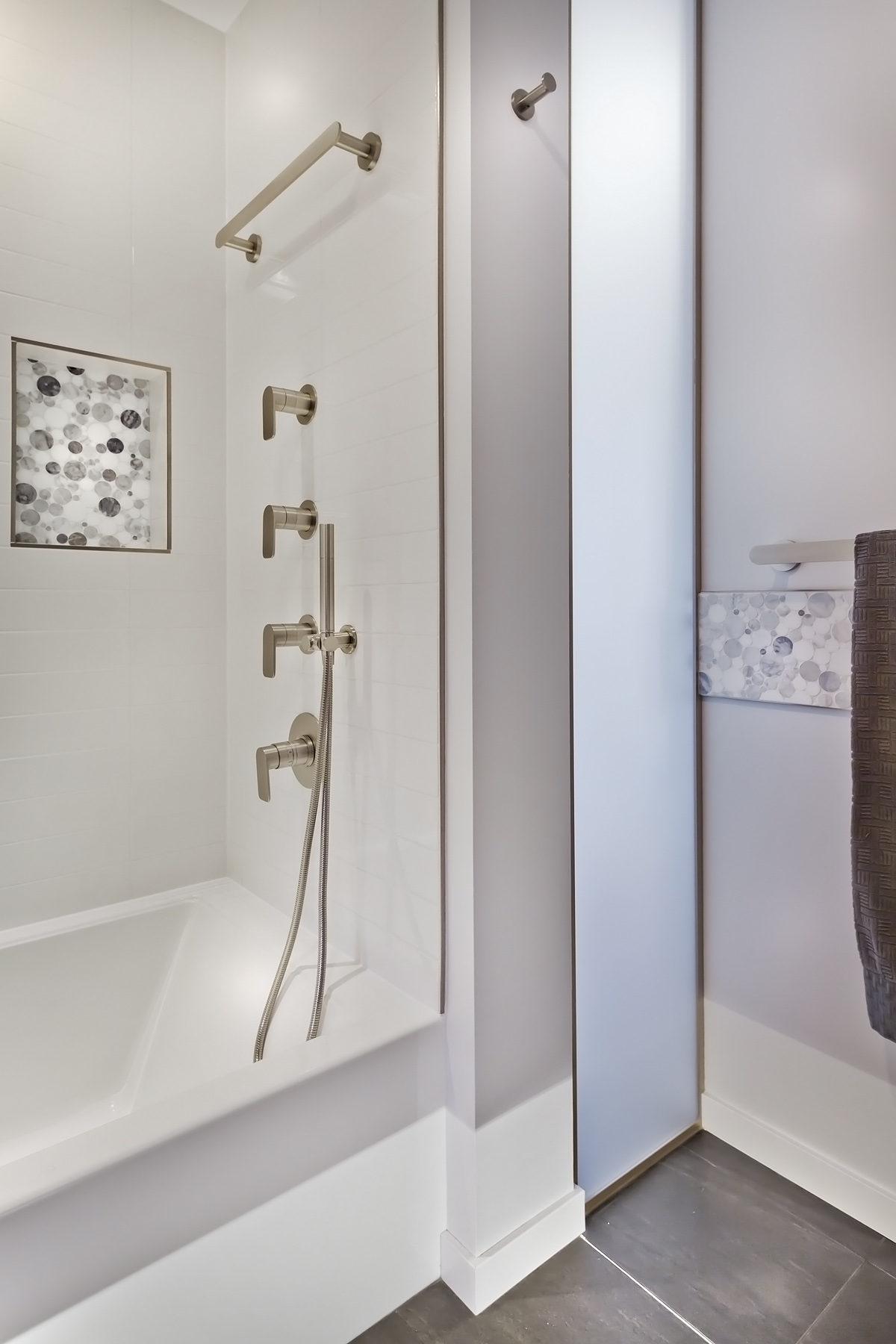
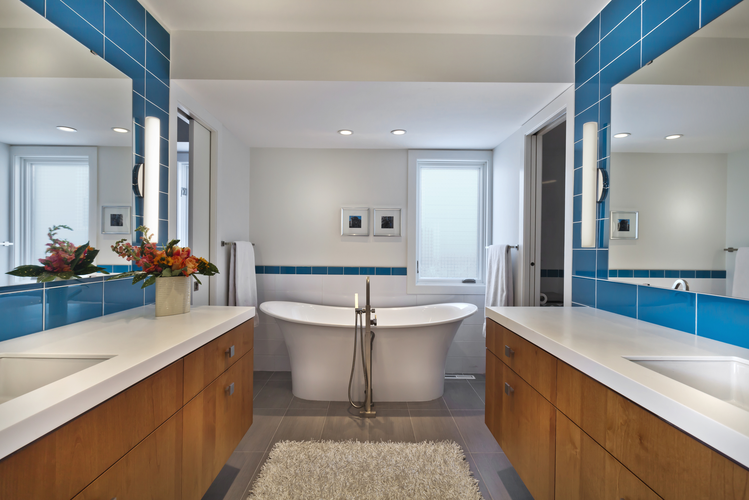
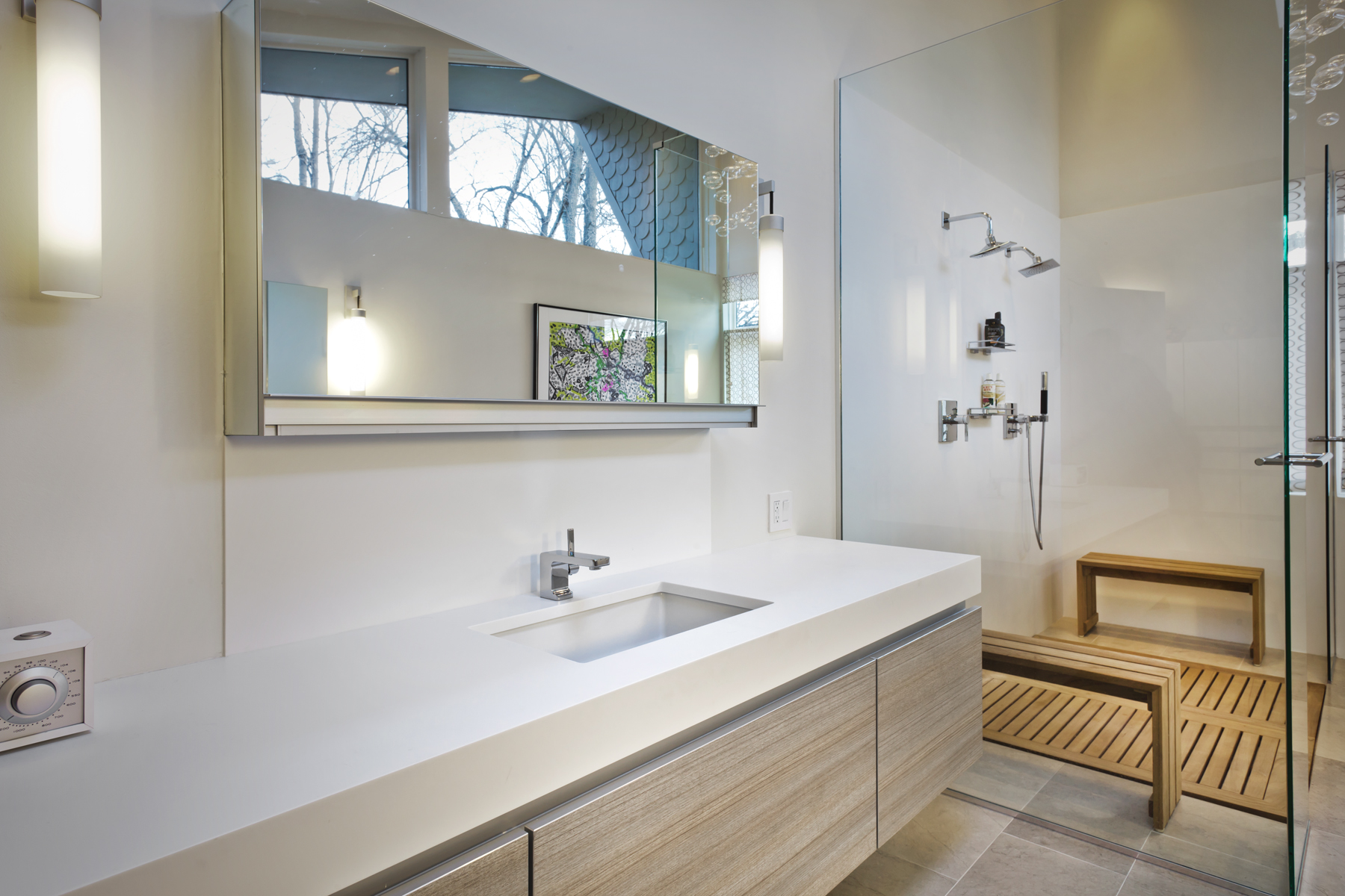
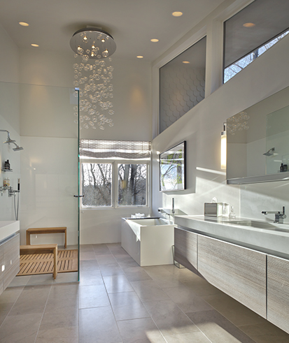
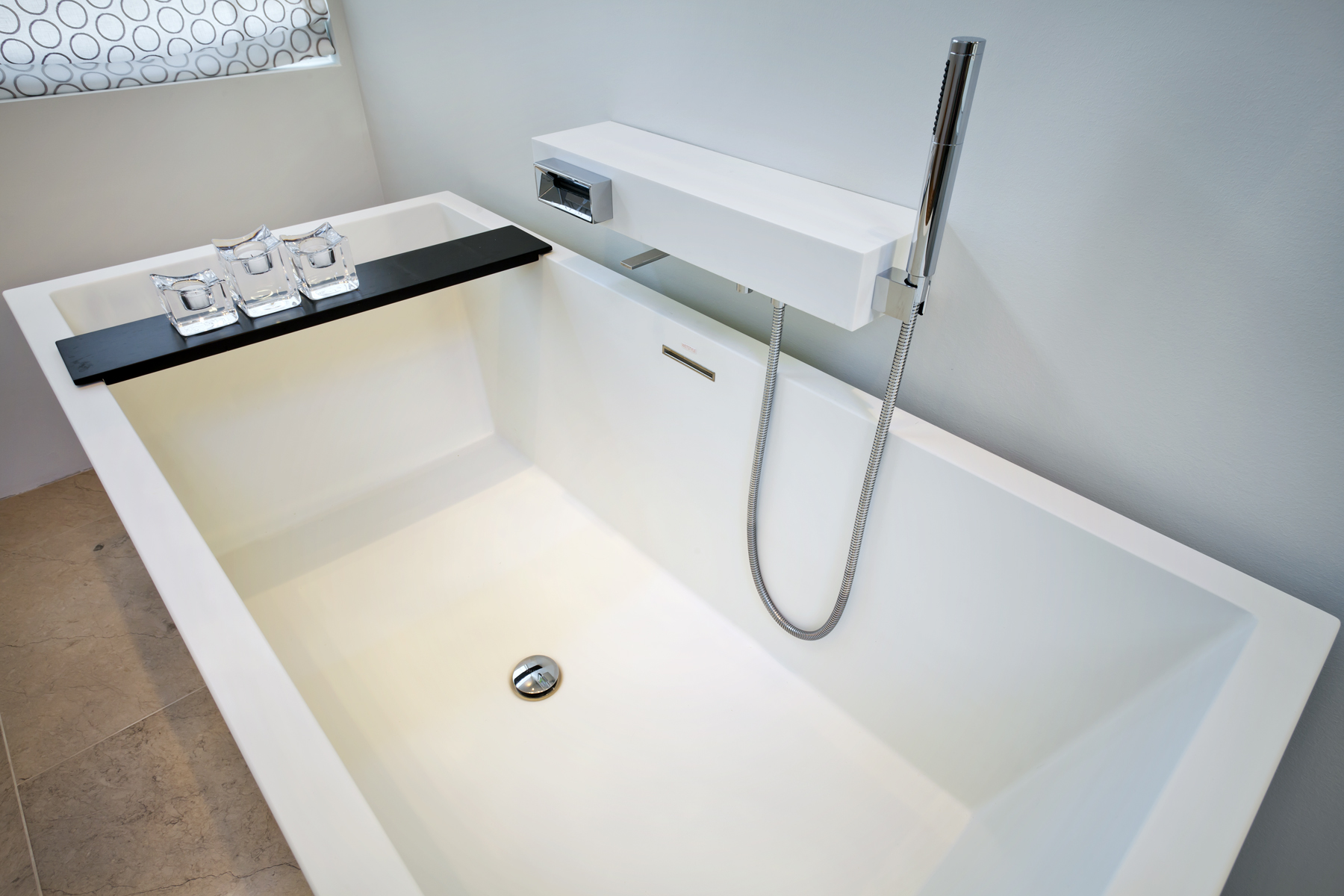
Part of the dramatic four room update in the Scandinavian style home includes a large bathtub placed by a window in the master bath. Stone mosaic tile with a three-dimensional feel is the focus in one shower and glossy subway tile in the other plus an updated light and bright powder room.

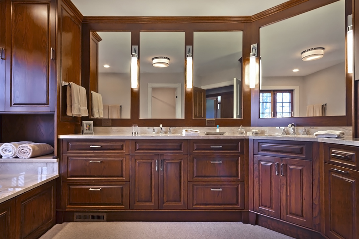
The renovation began with the master bath and the goal of creating a room with a view. The bath was designed with a marble tub deck. The same warm marble was used on the vanity and a recessed niche. A built in hairdryer unit plus jewelry and make-up drawers provide an uncluttered space for the owners.

Custom cherry cabinetry adds the stay-for-a- while ambiance. The existing wood door panel was a guide for cabinet design and a recessed molded panel for framing the tub. The pattern was carried to the vanity area.

Off-white tightly woven Berber carpet was used on the floors. While four pendant lights add a contemporary note to the room.

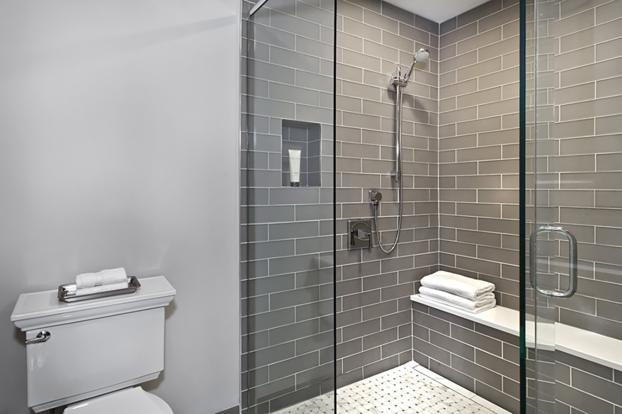
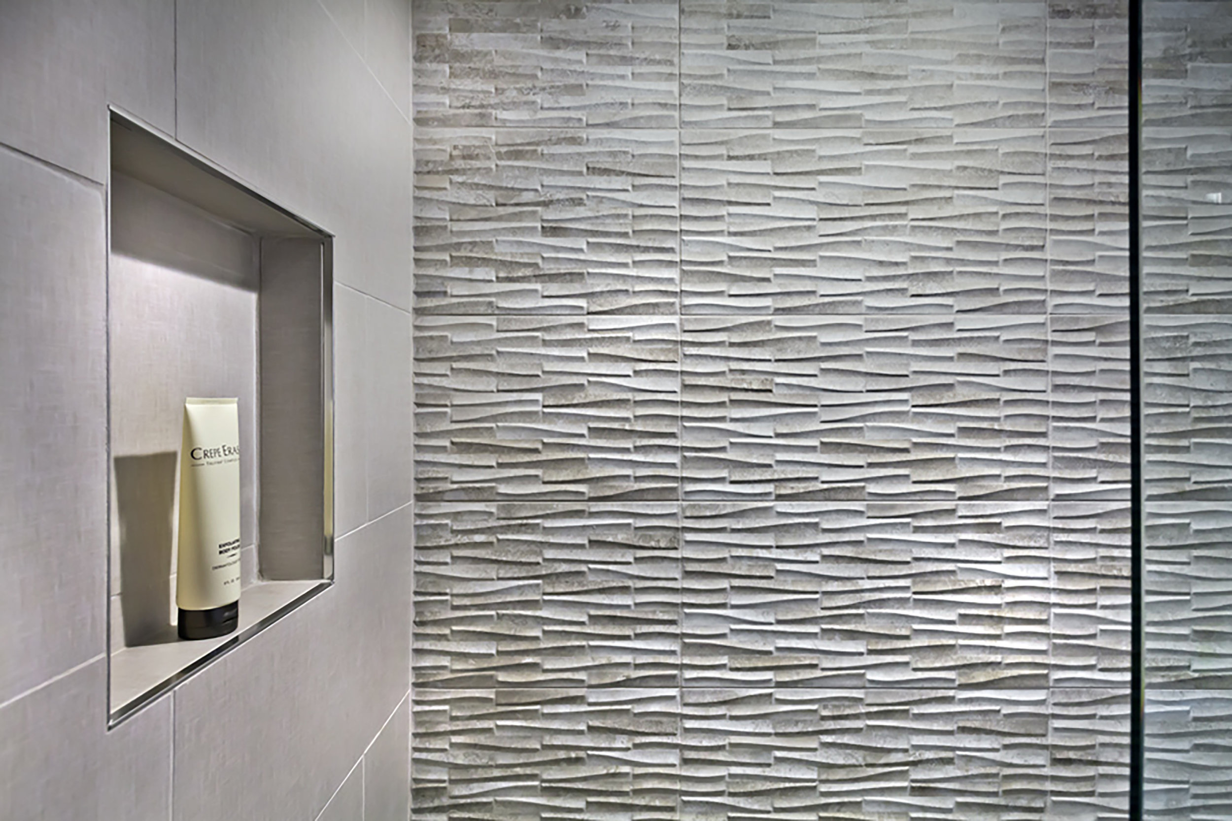
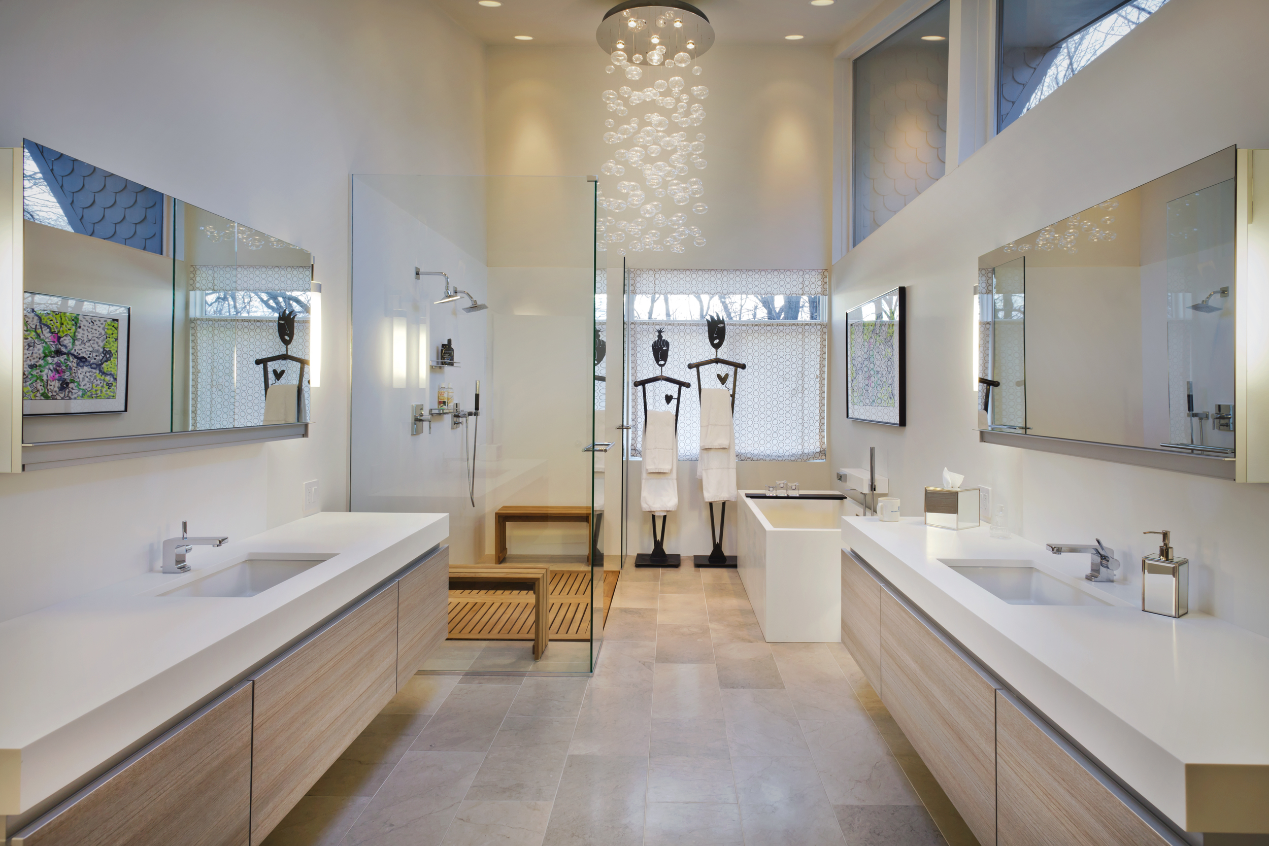
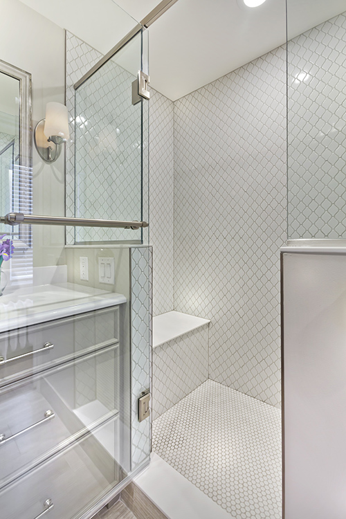
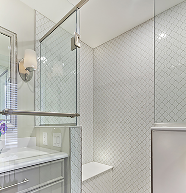
In the second bath, the tub and shower combo was removed to create a large shower. Leaf patterned stone tile in the shower creates a dramatic, three-dimensional effect.  For a change of mood, the owner can use a remote to change the lighting color in the shower. The floors are limestone and together the design decisions create an organic, summer feel to the room. Though not visible, there is a slope in the shower and a linear drain to direct water flow.

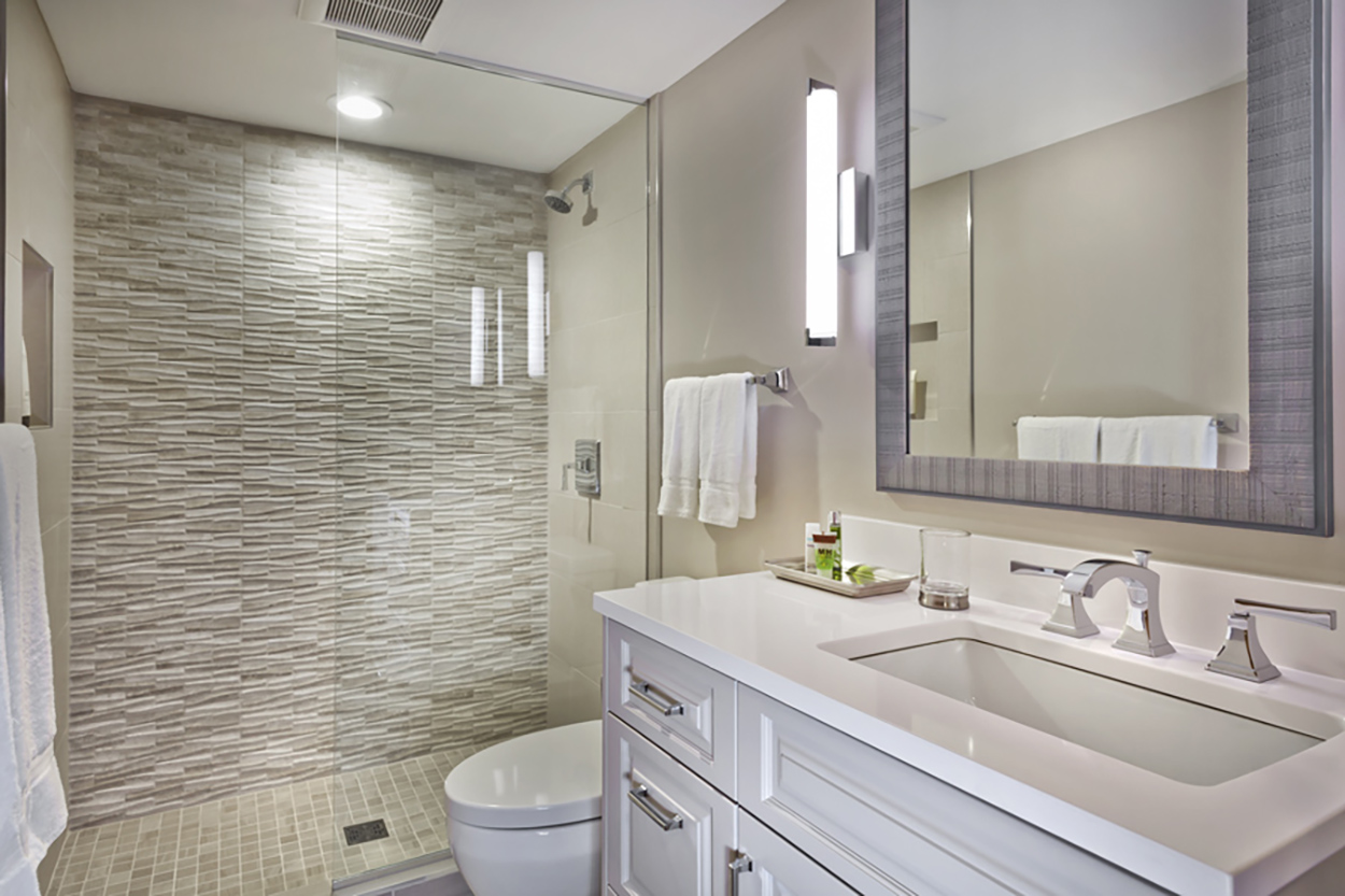
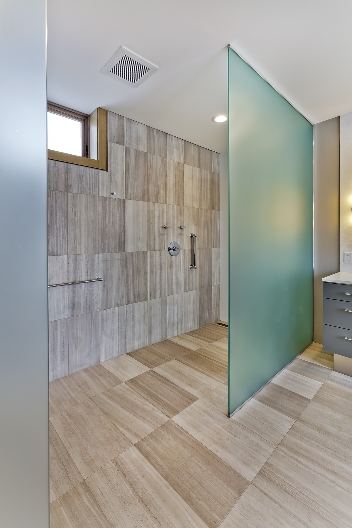
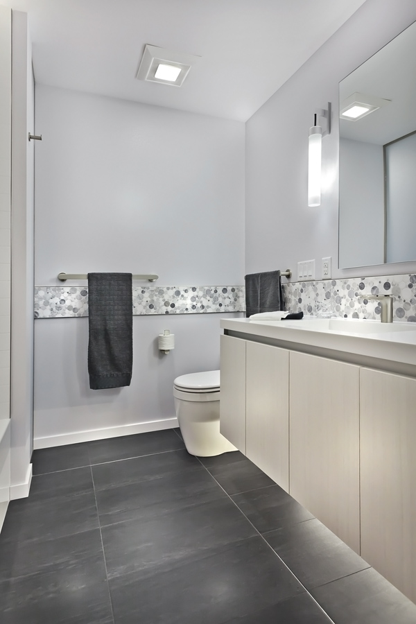
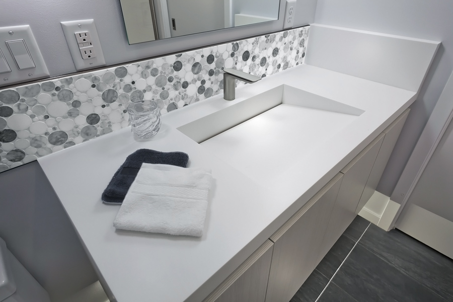
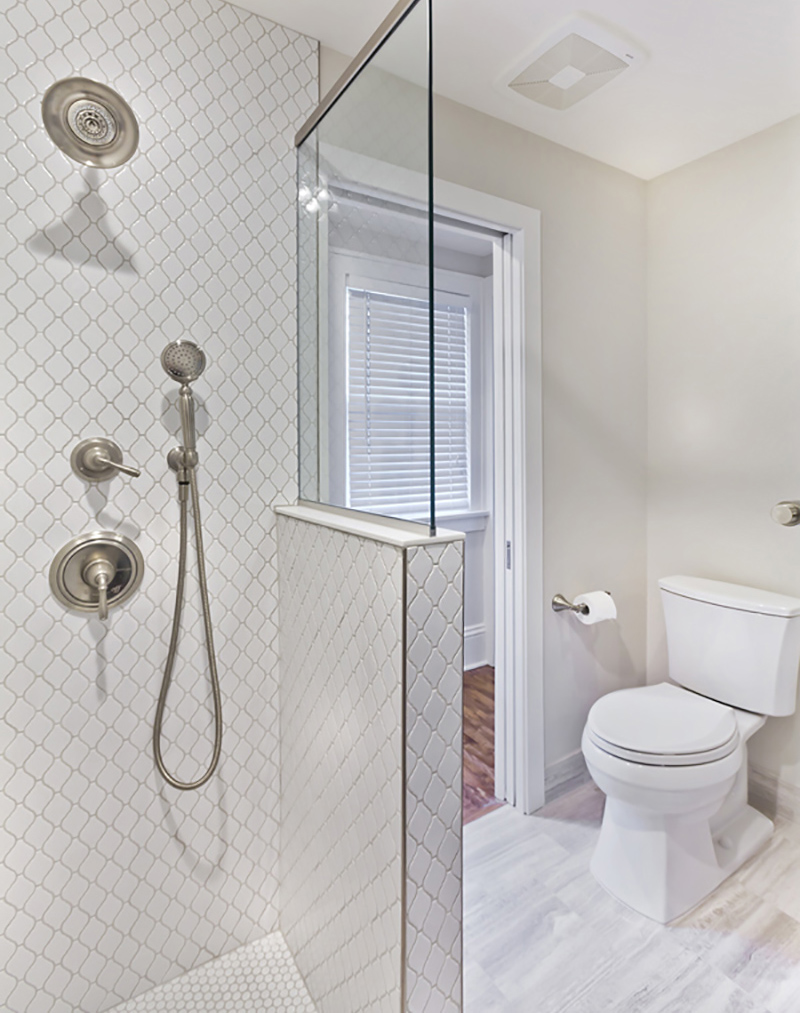
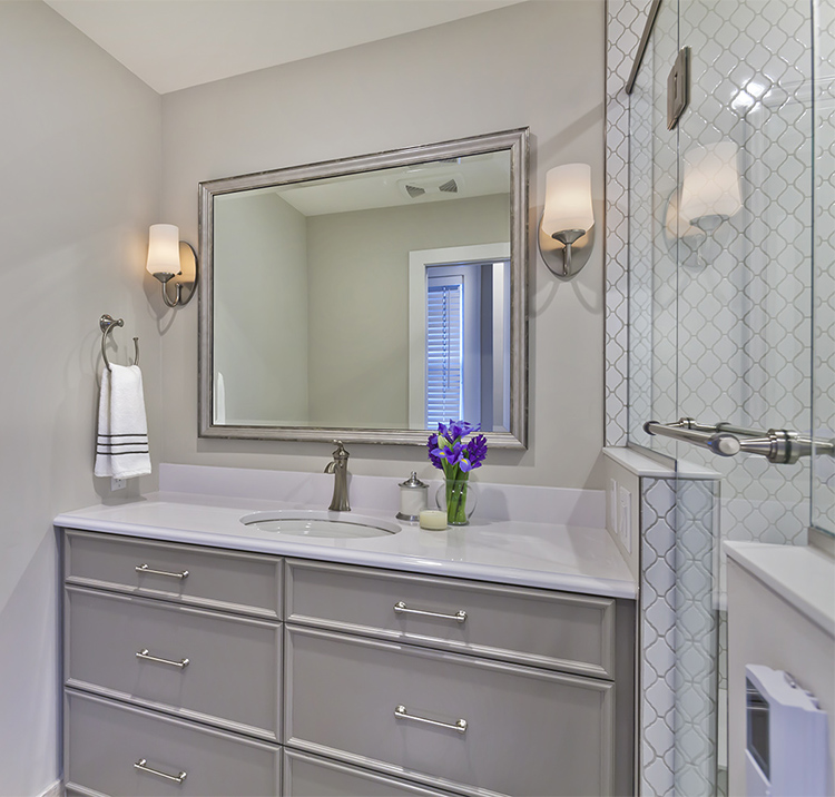
Glossy taupe porcelain tile and new LED lights star in the third, smaller bath. The shiny 12 by 24 wall tiles create a bright, efficient space. A half-glass shower wall was also used to create an open feel.

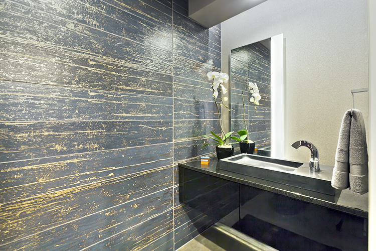
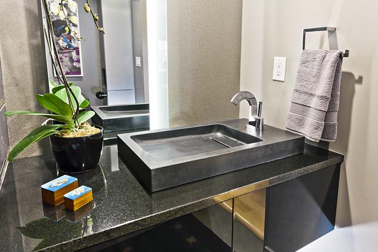
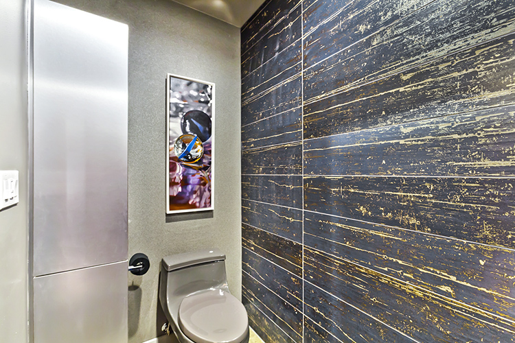
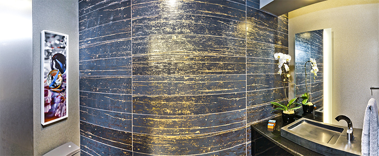
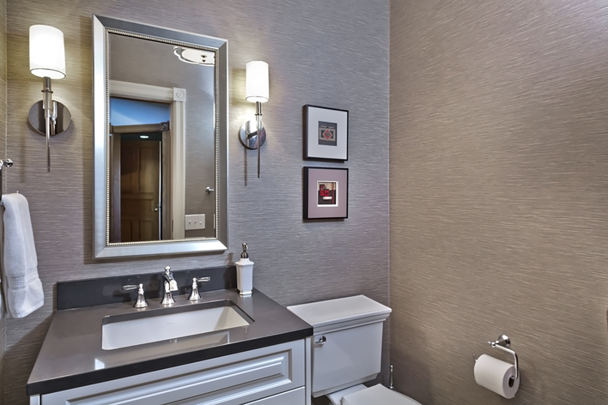
A quartz counter-top and textured wallpaper take center stage in the dramatic powder room update. An under-mount sink was chosen to create more space in the small room. Natural stone complements the counter. The same cabinet design was used but painted white for use in the small room.

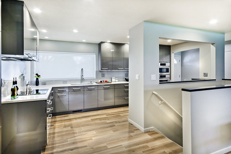
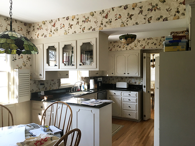
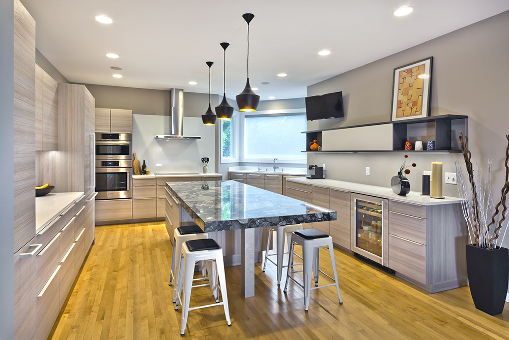
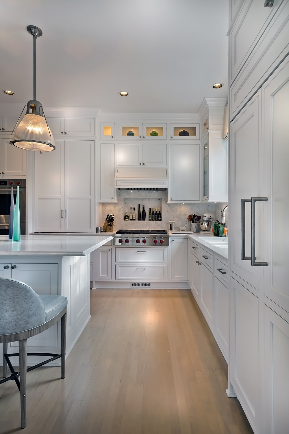
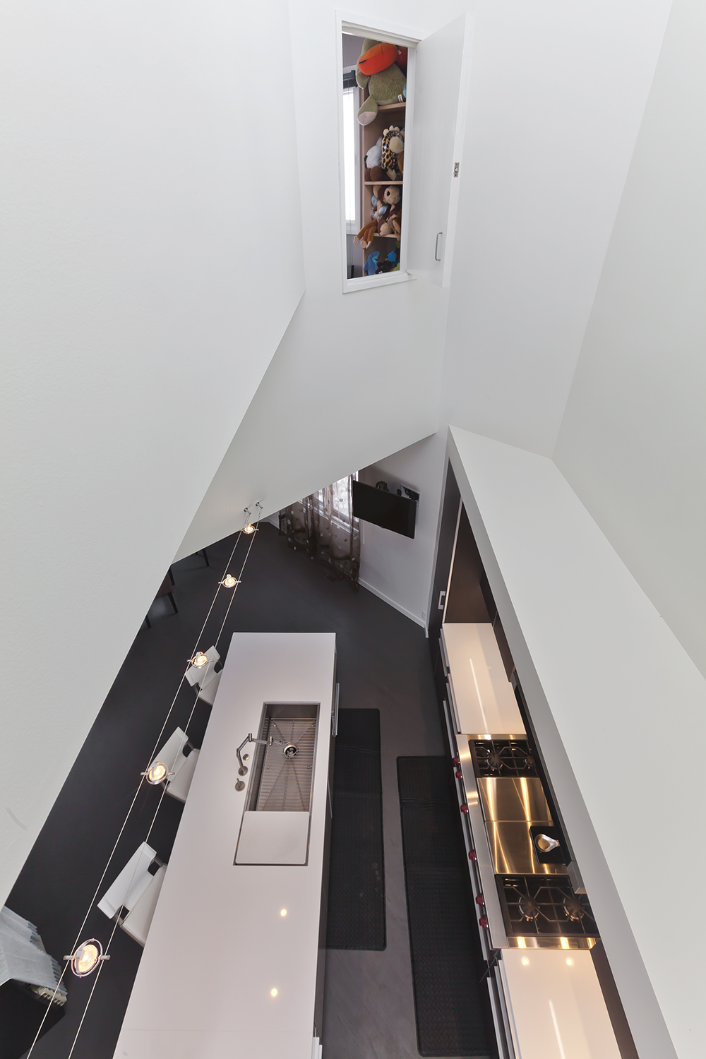
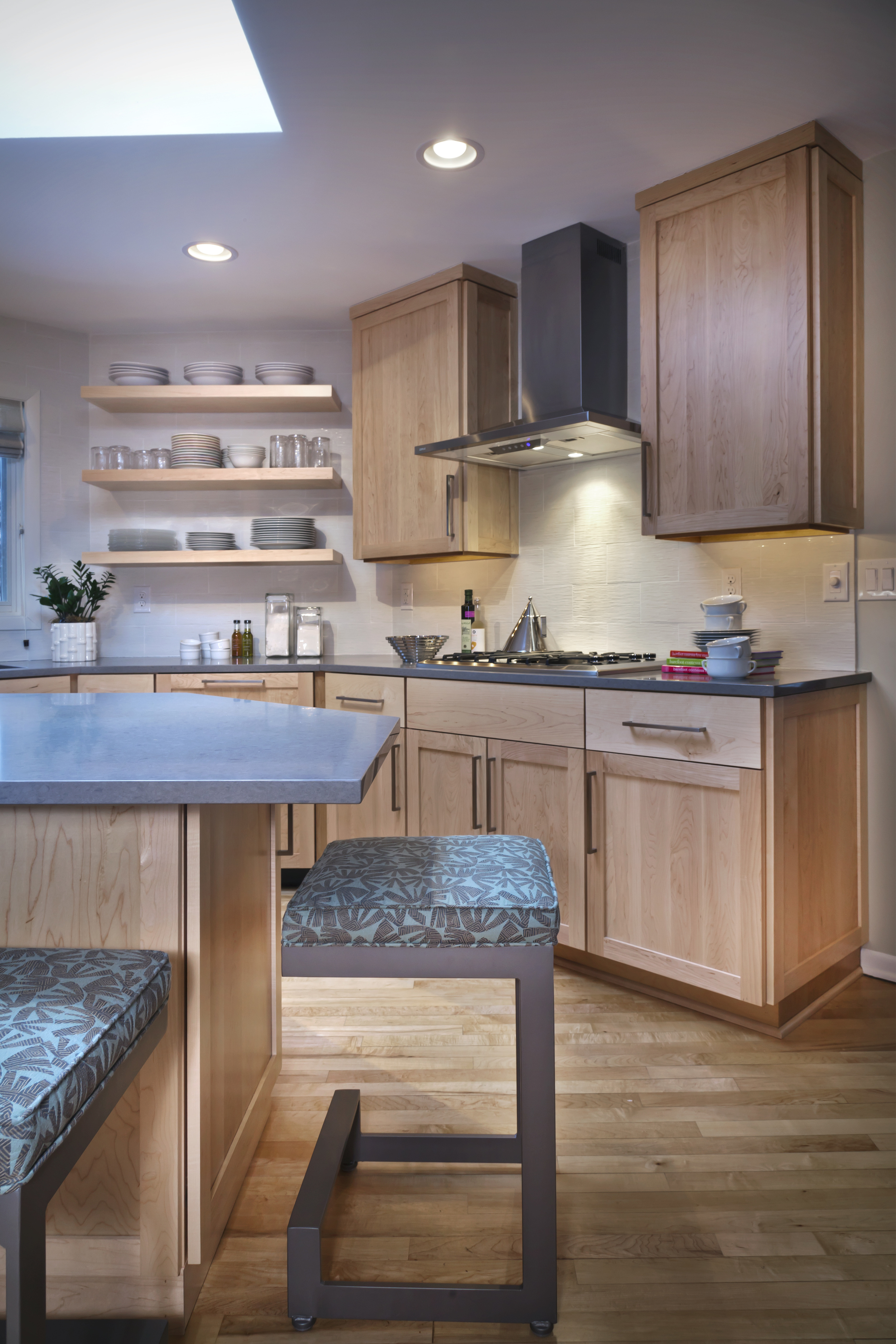
The updates were implemented with no changes to the footprint. (Photos/Gilbertson Photography)


Loft Kitchen Update

By e.l.

The kitchen in a downtown loft did not fit with the open feel of the rest of the space. It was incongruent.

The compact kitchen was worn out, tired and broken.  But there were strong bones to work with and a renovation gave the 1980s loft a bright new life.

The addition of a unique stone island that wraps around a supporting beam creates new space for seating, a wine cooler and storage.

To spread more light into the room a door opposite the kitchen was relocated to allow light to shine in the dark wood room with high ceilings. And for additional light, LED disks was added to the loft ceiling to replace track lighting.

White glass tile backsplashes and granite counter tops also give the room another light making element.

Contemporary laminate cabinetry was chosen to maximize storage options.

The design took shape to provide more storage and living space for the owners.

Efficient use of space in the kitchen was essential.

Rust colored floor tile connects the kitchen to the tones of brick walls in the living room area of the loft. New cream colored carpet replaces a Kelly green floor covering and adds to the update and connection the living room. (Photos/Gilbertson Photography)

Time Travel Renovation: 1960s to 2016

By e.l.

A fussy 1960s kitchen with a peninsular that broke a long, linear kitchen in two got a new face and more function with a P4D renovation.

The owners wanted to get rid of the dicey feeling in the kitchen of their two-story Edina colonial. The 10-foot by 19-foot kitchen was a truncated space with an open railing at one end that separated it from the adjacent living area. Coupled with the jutting peninsular, the room needed some space and light-making adjustments.

The footprint did not change and existing oak floors remain. But the railing and peninsular were discarded to create more workable space and room for a small table that can easily be stored when the couple entertains.

A serving counter and a desk were also added. White walls and porcelain tile backsplashes are also part of the light and bright formula.

White cabinetry with glass shelves and lighting add sparkle, as do three new windows on the long side of the kitchen. Cambria counter tops provide some texture and replace dark granite. Recessed can lighting was added and standard size stainless steel appliances completed the kitchen update.

As P4Ddesigner Anne said, “Lighting is the jewelry in a room.”

That is just what the owner wanted. She found it with colonial candelabra in brushed nickel. It hangs now above the new white farmhouse sink she coveted.

But there is more.

A small, dark powder room also got an update with white sink, toilet, and wainscoting. A new mirror brings in some sparkle to this essential room. (Photos/Gilbertson Photography)


Room Conflict Resolution

By e.l.

The kitchen and living room were in conflict. It was an age issue. The kitchen was of no particular era except old while the living room was a confident contemporary.

The owners found resolution with design therapy for their suburban home.

Sleek teak colored laminate cabinetry and new appliances were chosen to update the room. Blue-gray tones in the cabinets have the effect of pulling blue from the living room into the kitchen.  Warm wood floors further unite the rooms.

 A new design reconfigured the work areas.

The layout was not efficient with the refrigerator and stove isolated at one end of the room. That means more steps to prepare meals. The new design creates work zones for cooking and prep, cleanup and storage.

The old island was replaced with 9-foot granite island centered in the room to create a strong sight line from the living room and provide additional storage and seating.

Some of the new details include a storage pullout unit by the induction stove and an appliance garage to control inevitable counter clutter.  A beverage cooler was also added.

The sink and dishwasher stayed in the original corner location with a window view of the yard.  All counters were replaced with white quartz and white glass backsplashes installed to give the room another light-catching element and contemporary feel. (Photos/Gilbertson Photography)

Flipping a U-Shaped Kitchen

By e.l.

A smart designer made strategic decisions to orient a separate, isolated kitchen to make it part of main living space in a mid-century split level home.

The design made changes to update, streamline and create more storage in the kitchen.

A priority for the owners was to re-orient to their kitchen so it's not the first room they see first when they open the front door.

Removing a wall that opened into the living room, dining room and porch and flipping the u-shaped work area in the kitchen reoriented the circulation.

There were constraints. There is only a six-inch space between the original cedar kitchen ceiling and roof. Recessed lighting was not an option because of height restrictions. It also meant additional heat from recessed cans, could cause ice-dams. The problem was solved with LED track lighting that emits minimal heat and is surfaced mounted.

As with most updates, the goal is to bring in more natural light. Adding solid pieces of white satin glass for the back splashes created a light and airy feeling as well as eliminated old tile and grout for easy maintenance.

A structural beam that didn't match the ceiling was painted dark bronze. One section of the reconfigured kitchen holds new wood-tone laminate cabinets with black granite countertops for contrast. New white and gray granite counter-tops and cabinetry marry for a crisp black, white and bronze color scheme.

The new range vent hood and coffee space were two more elements used to update the kitchen. Adding cabinetry under the window in the breakfast room was an ideal spot for coffee service that was easily accessible. (Photos/Gilbertson Photograpy)

The Essentials: Kitchen and Bath for Lake Dwellers

A surgeon with an an affinity for tight tolerances and precision engineering chose Poeggnephol cabinetry for a kitchen and bath.   (Photos/Gilbertson Photography)

The Final Kitchen

By e.l.

Our clients waited 20 years to create the kitchen of their dreams.

First they had to decide where and how they wanted to live as empty nesters. A loft on the Mississippi River was promising but it just didn’t give them all they wanted. And, their 48-inch Viking stove was broken. The ailing stove was pivotal.

One owner is an enthusiastic cook, the other a happy recipient of his efforts.

With the big decision about where to live, one thought led to another and they decided to change their kitchen. Out went the contractor’s cabinets that came with the house.

Early in the design process, they arrived at the P4D showroom to buy high-gloss stone gray Poggenpohl cabinets to get the aesthetic they wanted, the storage they needed and the efficiency that reflects their purposeful nature.

There was no doubt about the cabinet choice. From there the dream evolved from discussions with the project designer. Concerns about the chaos and disruption of a bigger renovation project were tempered by a design created to use existing space and get a lot more from it with a minimum of disruption.

A significant change and one that delights the cook was relocation of the refrigerator. It was moved to the opposite side of the room and made space for a food prep area. The old refrigerator was not flush with the wall and blocked entry and site lines to the kitchen. Placement of the new stainless-steel built-in refrigerator added significant work space and flow to the room. To minimize plumbing changes, a custom three-bowl square corner sink and a Dornbracht pivot faucet serve v-shaped space. The result is more space under and on both sides of the sinks so cabinet doors don’t block adjacent lower-level cabinets. The corner was completed with between-the-glass blind windows from Pella trimmed in back-painted glass for easy maintenance.

The color palate for the room, established early with sleek gray cabinets was enhanced with gray and white granite counter tops. A black granite island counter was rejuvenated and the room brightened with task lights and white painted glass back splashes.

The new kitchen creates a harmonious connection to the couple’s colorful art collection. (Photos/Gilbertson Photography)


A Unification Project

By e.l.

They wanted to unify a dark isolated kitchen with the living room area in their downtown high-rise condominium. These empty nesters wanted to create an area for dining, cooking and entertaining.

A large part of the design process in a renovation involves taking advantage of the existing strengths of a floor plan and working with the particular challenges of a condominium update. There are structural elements that simply cannot be changed.

An essential piece of the design goal was to make the most of an abundance of ambient light in the living and dining area, says P4D architect John Idstrom.

To that end, most of two walls that separated the kitchen from the living area were demolished. The mechanics of a sprinkler system had to be maintained so only a partial removal worked on one end of the kitchen. That adaptation became a design element to create a minimal and unique separation of the kitchen from the rest of the living area.

Warm wood cabinetry from Crystal Cabinets coupled with granite counter tops, and a country sink were selected for a clean traditional feel. Track and pendant lighting gives the kitchen another boost of light.

While oak flooring further unifies the kitchen and living area and creates a natural flow between the two.

The unification of cooking and living was accomplished. (Photos/Gilbertson Photography

Urban Living Refined

By e.l.

After a recently retired couple moved into the condo of their dreams they knew the cramped u-shaped kitchen would not do.

Their kitchen was dark and not efficient mostly because of two closets that blocked an abundance of natural light in the living and dining room.

Working with P4D designer James O’Neill the couple agreed to let go of the closets to create a more functional L-shaped space. To replace the closets, bright white cabinetry from Crystal Cabinet Works provided light and storage. Ceiling cans and pendant lighting were also added.

For the sake of a couple that like to cook, a gas stove top was added. And, an island anchored to one wall was positioned to the center of the room to provide smarter work and play space.

Black granite counter tops add contrast to the room and white marble chevron tile backsplashes add texture to the black and white room. Working with designer Laura Potter, the pair carried the black and white palate to the living and dining spaces.

The new design includes a sexy custom black painted custom bar from Crystal constructed to fill a recessed wall in the dining area. Complete with a modern coffee machine and beverage cooler the owners expanded their entertainment space.

 The black and white palate is extended to the living room where statuary marble was chosen to surround the fireplace and create a dramatic focus for the room.

As with many condo renovations the goal is to capture light and add efficiency without major alterations to the footprint. The new design did just that. (Photos/Gilbertson Photography)

Glass Works

By e.l.

When an architect who loves Legos and lives in the suburbs with a fluffy white dog named Puff Daddy wanted to update his second story bathrooms he turned to another architect for help.

The collaboration between P4D architect John Idstrom and the owner resulted in a smart and stunning solution for a light starved guest bath and update for both.

The challenge was to brighten a windowless guest bathroom and coordinate the renovation with the master bath in the back-to-back second floor configuration.

Their solution was to catch light from the window in the master bath by placing frosted glass on each side of the toilet. One panel throws light into the guest bath and the other sends light into the stairwell. Sections of walls were removed to accommodate the frosted glass panels.

A horizontal swath of gray and black marble bubble tile above the two sinks in the master and one in the guest bath glass creates a visual connection between the two.

Sleek white contemporary cabinetry from Crystal Cabinets and trench drain, solid surface sinks in both create a clean contemporary feel.

The natural palate of gray, black and white tile provides an earthy, unpretentious feel. LED lighting under the sinks also adds another light source and completes the contemporary look. (Photos/Gilbertson Photography)


A Living Room

By e.l.

Each day in this house begins and often ends in the kitchen. This is where friends and family gather for meals, homework and conversation.

There was no part of this kitchen that wasn’t doing its job well. Rooms do get tired and it was time for some rejuvenation. A P4D renovation added efficient and energetic elements to this hard working room home. Traditional white cabinets bring energy to the light filled room warmed by wood floors and colorful rugs. The challenge was to create depth and texture with a white palate. Old counter tops were replaced with white quartz. An arabesque marble pattern used for the back splash adds dimension. A custom crisp white Corian three-bowl sink and new white appliances were also added. For the sake of a tidy kitchen, pocket doors were installed to hide and hold a coffee station with extra storage. 

While the footprint was not expanded a kitchen desk was reconfigured to add a wine refrigerator and beverage station and retain counter space for a desktop computer.

Another adjustment moves the focus of the room to a new fireplace in the kitchen with a television above it. Now, the fireplace is visible in the living room and kitchen. The change serves as the focal point of the room and warms even more, this bright white renovation. (Photos/Gilbertson Photography)

Urban Smart and Small

By e.l.

Like a strong declarative sentence, this new kitchen makes a clear design statement.

The homeowners wanted to transform their small sun room into a kitchen. With one wall and an island the architect designed a contemporary kitchen to optimize a vibrant urban view.

A crucial element in the design was installation of a sheet of aluminum attached to the sheet rock behind the single solid wall in the new kitchen. A full-size aluminum refrigerator frames one side, a full-size freezer the other. The sink, dishwasher and cabinets are centered and highlighted with white marble counter tops and back splash. In the configuration a stove top and range reside in the marble wrapped center island with additional brushed aluminum cabinetry. And, the owners have a view while they cook. Six pale yellow globe lights add warmth to the already light filled room. The choice of open touch cabinets and drawers are part of the no frills design.

The architect said the decision to combine marble with contemporary aluminum and warm wood floors is meant to meld new materials with architecture of the 1920s home. (Photos/Gilbertson Photography)

Let the Sunshine In

Embrace our Minnesota weather from a ring-side seat in a light filled kitchen. This P4D design connects with the outside by using rich wood on windows and counter tops. Sleek cabinetry and smart design create a contemporary room that offers an invitation to linger. (Photos/Gilbertson Photography)

Center Stage

By e.l.

The remodel of a James Stageberg designed home is an exercise in addition and subtraction. The residents wanted a larger kitchen, less color, more function for their home built in 1980s. A dramatic subtraction of half -round moldings and multi-colored walls throughout the house create a serene white canvas for the couple’s art and furnishings. White provides a visual priority to the architectural drama of the house. With the exception of a bathroom tiled a bright blue that flirts with the exterior shades of the house, a neutral white dominates the rooms and provides the museum quality the owners favor.

The original kitchen was an efficient galley style but not enough for a passionate cook. Modified walls and ceiling intersect with the existing galley space to emphasize the stunning, two-story room open to the roof. A new island and seating are an invitation to the kitchen while windows wash the room with light. The cabinets along the cook top wall are brown, textured laminate and the island cabinetry is a high gloss, sand colored, lacquer finish. White quartz counter tops wrap the island and surround the cook top. Existing wood floors are re-stained gray. White walls and a center stage kitchen embrace and showcase the complex geometric design of the house. (Photos/Gilbertson Photography)

Lake Minnetonka

A contemporary home designed by Milo Thompson in the 1970s, remains a strong and beautiful structure. But it was time to refresh the Minnetonka home and P4D stepped in to streamline the four-bedroom, four-bath house. The commitment to a pale, unobtrusive palate and functional space-saving solutions guided the award winning master bath update.

A bulky double-sink vanity with white tile and laminate counter tops dated the room and crowded the space. The new design includes two cantilevered vanities on placed on opposite walls to create a personal space for each owner. Soothing gray-hued teak cabinetry complements large-scale limestone floor tiles and delivers a contemporary kick with sleek aluminum edging. Chrome faucets complete the contemporary silhouette and storage is created with convenient lift-up medicine cabinets and high gloss acrylic cabinets. The toilet is enclosed with a frosted glass panel and door. Clear glass surrounds the two-person shower next to a large freestanding tub and a view of the lake. Teak benches, the owners say, remind them of sailing on Lake Minnetonka. A streak of blue connects the room to the outside.

The function and clutter-free design sense was also applied in the kitchen where glass back-splashes catch light and add sparkle. Chandeliers in the kitchen and bath add a touch of whimsy and complement the owner’s art collection. All bathrooms are updated with similar sleek cabinetry and smart storage solutions. (Photos/Gilbertson Photography)

Dark Spot: Gone

By e.l.

The bath in this 1950s rambler felt a like dark spot in an otherwise light filled Crystal home. Partner’s 4, Design approached the renovation of the main bath by shedding dark colors. Gone are dark tile and muted wallpaper in exchange for neutral tones, glass and white fixtures to create a transitional feel.

The layout of the room remained the same but the wall around the tub was reduced to a half-wall with the addition of a glass panel. Vanities on both sides of the entry create a larger sense of space the clients wanted. Architect John Idstrom said a room redesign should make its users feel like they’ve been somewhere unique. But it was also essential to blend elements of the new bath with the already updated house, he said. The re-imagined room should not feel discordant or be a jolting surprise, he said.

The process began with the client’s choice of warm wood cabinetry and natural stone floor tiles that relate with light tones in rest of the house.  As with all design projects, success depends on a myriad of details. A light palate and warm wood cabinetry create an updated 1950s feel. The tub and toilet were chosen for their traditional, sculptured details to relate with the rest of the three-bedroom, two-bath house. Sculptured nickel-plated fixtures add another light catching element to a successful renovation. (Photos/Gilbertson Photography)

1920s Redeux

By e.l.

The move to a new home in south Minneapolis from the suburbs gave our client most of what she wanted in a smaller home

But one change just had to be made to the 1920s duplex.

 A must for her was a larger shower with a bench seat, heated bathroom floor and a walk-in closet.

The P4D design solution reconfigured the existing space. The original powder room wall was moved into an adjoining room and an entryway was closed to expand the size of the bathroom and provide for a bigger closet.

The new bathroom reflects a fresh and updated design with warm maple floors and a calming, contemporary palate. The client selected neutral colors to ensure a peaceful, spa-like feel.

Placement of a pocket door with a frosted glass panel was used to capture natural light for the space.

Arabesque tile, penny round floor tile in light enhancing colors and the addition of can lighting create a fresh and inviting room. The frosted glass door opens to the hallway and serves to carry light into the room.

Now the heated floor has become a favorite feature for both the owner and her cat. (Photos/Gilbertson Photography)


Friendly, Efficient and a Touch of Red

Room to Play

By e.l.

The owners wanted more room to play. And they wanted a light bright feel to their space.Like many homes in southwest Minneapolis, the residence is a split-level house with a seasonal family room addition. P4D was asked to update the kitchen and convert the seasonal room to a year-round room to accommodate their grandchildren who visit often.

Doors and windows that separated the kitchen and family room were removed to bring in light and create continuity. New, larger energy-efficient windows in the family room provide more visual space, light and essential comfort. The floor in the addition was raised to add heating ducks and oak floors were installed in both rooms to create flow between the two.

The decision to add white appliances and cabinetry creates a fresh atmosphere spurred by the owners’ affection for hand-made tile that serve as a back-splash above the range. The soft color of the tiles offers a pleasant focal point of the room.

A lighted display cabinet in the island displays a collection of children’s china. Reconfiguration of the kitchen also provides a sight line to the family room where grandchildren often play.The result is a renovation to serve the family for many years. (Photos/e.l.)